Building a Tableau Dashboard

So far, I have covered various topics involving data collection, data mining, data processing and machine learning. While all of these capabilities are important in the role of a data scientist, it is important to know how to present your findings to others in a clear, user-friendly manner. In light of this, I want to use this blog post as an introduction to the world of data visualization, particularly the use of Tableau.
Tableau is a powerful tool that can help data scientists showcase their datasets, analyses and results. Below, I will walk through a simplistic dashboard that I have created in order to demonstrate some of the many ways to use Tableau to display data.
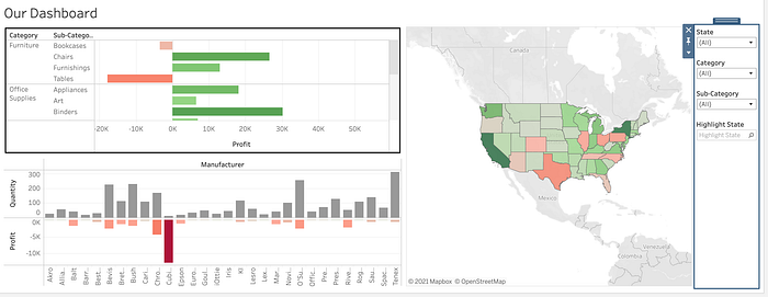
To begin, here is a snapshot of the dashboard I created that I will be walking you through:

Worksheets
Dashboards are compromised of various different worksheets. In order to understand a dashboard, one first has to understand how to build graphs in a worksheet. In this blog, I will walk through the worksheet that is highlighted in the image above — the graph that looks at category, sub-categories, and their profits.
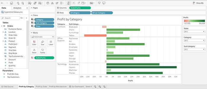
Worksheets essentially are blank canvases that allow you to drag and drop data in order to tell a story. All the items of the original dataset are shown directly next to a workbook and it is specified whether a column is qualitative or numeric. These different aspects can be dragged to the screen to be investigated further — in this example, the qualitative columns that are used are category and sub-category, and these items are placed in the “rows” section. The “columns” section contains the numeric field, “profit”. This is what this looks like in a worksheet in Tableau:

Dragging “profit” to columns and “category” and “subcategory” to the rows will not result in a table above looking like this. I will explain how I was able to create the user-friendly graph above.
The first thing to note is that the SUM(Profit) measure is color coded. This mark has been edited to be darker green for more positive values, and darker red for more negative values. This provides a visual component to the values and helps the viewer understand which subcategories had strong negative or positive profits. We see the legend on the right explains this as well.
Another important piece are the “filters”. Including filters allows the viewer to specify which specific items, in this case categories and subcategories, they would like to zero in on. At the moment, the dropdown says “all” but a user could go in and change this to specify further which exact values should be filtered.
There are many (many many many) other aspects that could be added to this worksheet, however for now I would like to keep the explanation simple, as this blog post is only meant as an introduction and a first-glance into what Tableau is capable of doing. Do note though that there are various other types of graphs, visualizations, titles, formatting etc. that can be done, and these exact details will be looked at in a later post.
Dashboards
Dashboards are a collection of workbooks. You can drag and drop different workbooks into your dashboard in order to create a visualization that contains all of your graphs. A few “good to know” things about dashboards -
- You can select “tile” vs. “floating”, which allows you to customize your dashboard to contain a more organized, clean view (tile) or adjust sizes of different workbooks to any configuration you want (floating)
- Filters can be applied to only one specific notebook, or to all workbooks containing the data source. If you choose to apply filter to all the workbooks, the entire dashboard will adjust when a filter is selected. Pretty cool!
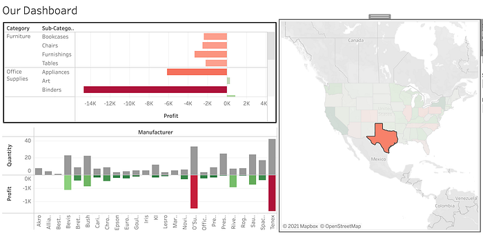
- ‘Actions’ are a major component of dashboards. There are a few types — filter, highlights, URLs. If you select a filter action, in our example say you selected the worksheet with the map of the USA as the source sheet, and the other worksheets as the target sheets, selecting one state would automatically filter the other sheets to contain only relevant information for that state. Here is an example:

Above, only Texas is selected, and the dashboard now contains Profit by Category and Profit by Manufacturer information for Texas. Including an action into your dashboard allows a viewer to easily dive. deeper into the data you presented, as well as quickly customize the visualization to match their specific interests.

This post only scratches the surface on Tableau’s functionalities, however I hope this was a manageable introduction to data visualizations and some of their capabilities. Check back soon for more posts on Tableau that elaborate further!